
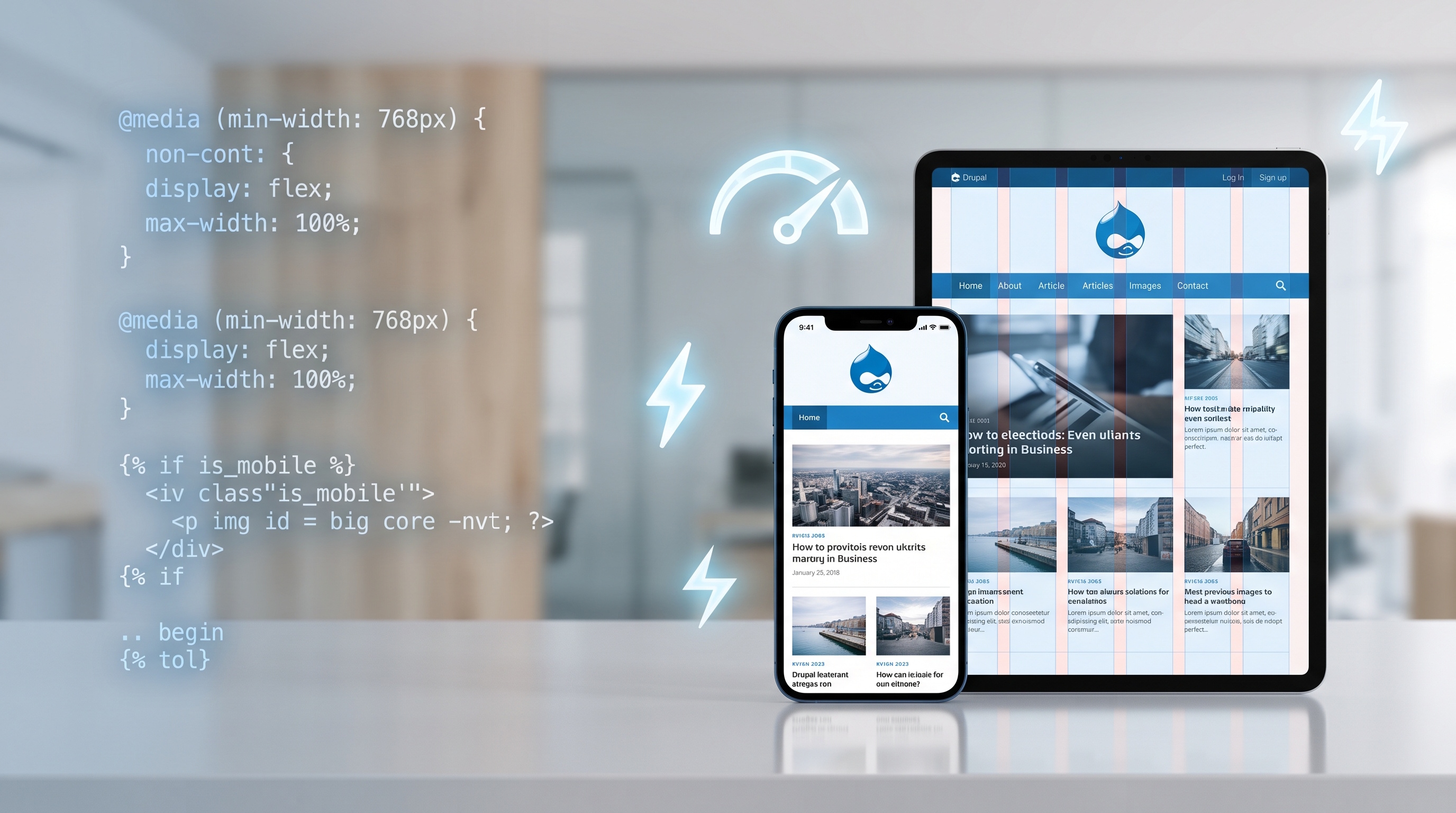
Drupal makes it easy to build mobile-first sites with its themes, image tools, and fast architecture. If you prioritize your content and test it thoroughly, you can create a great experience on any device. Since Drupal is flexible, your site can grow as mobile technology changes.
Introduction
Most people browse the web on phones and tablets today, so your site has to work perfectly on small screens. Drupal is built to handle this. It helps you create responsive designs that load fast and look great on any device. This guide covers how Drupal handles mobile users and the best ways to set up your site.
Understanding Mobile‑First Design
Why Mobile‑First Matters
- Users expect instant access to information on small screens.
- Search engines prioritize mobile‑friendly sites in rankings.
- Mobile usage drives conversion rates for e‑commerce and lead generation.
Start by designing for the smallest screen first, then add more detail for desktops. This approach keeps your code clean and makes sure everyone has a good experience, no matter what device they use.
Core Principles
1. Pick Your Main Content (Put the most important info where mobile users can see it immediately.)
2. Add Features Slowly (Start simple and add complex layouts only as the screen gets bigger.)
3. Focus on Speed (Make sure your site loads quickly even on slow mobile data.)
Drupal Features That Support Mobile‑First
Responsive Themes
Drupal comes with several ready-to-use themes like Olivero. These themes include:
- Fluid grid systems built on CSS Flexbox or Grid.
- Breakpoint definitions that map to common device widths.
- Built‑in support for responsive navigation patterns.
You can use these themes as a starting point to build a site that automatically adjusts to any screen size.
Adaptive Image Styles
Huge images slow down mobile sites. Drupal fixes this with:
- Image styles that automatically generate scaled, cropped, or filtered versions of an original file.
- Responsive image modules that deliver the most appropriate image size based on the visitor’s screen width and pixel density.
- Integration with CDNs to serve images from edge locations, further reducing latency.
Once you set these rules, you can upload high-quality photos and Drupal will resize them for you.
Layout Builder and Flexibility
The Layout Builder lets you drag and drop parts of your page. For mobile, it allows you to:
- Section containers that can be assigned visibility rules for specific breakpoints.
- Column configurations that collapse or re‑order on smaller screens.
- Reusable layout templates that enforce consistent mobile patterns across the site.
These tools help you keep your site mobile-friendly without needing to write a lot of code.
Performance Optimizations
Drupal includes several tools to make your mobile site faster:
- Cache tags and contexts enable granular invalidation, ensuring that only necessary content is refreshed.
- BigPipe streams critical page fragments to the browser early, improving perceived load time.
- Asset aggregation combines CSS and JavaScript files, reducing HTTP requests.
- HTTP/2 support leverages multiplexed connections for faster asset delivery.
Using these features makes your site feel snappy and reliable for everyone.
Implementing a Mobile‑First Strategy with Drupal
Planning and Wireframing
- Define primary user goals for mobile (e.g., quick product discovery, easy form completion).
- Sketch low‑fidelity wireframes that focus on essential content and navigation.
- Identify breakpoints that align with target device demographics.
Theme Selection and Customization
- Choose a responsive base theme that matches the project’s visual language.
- Create a sub‑theme to override styles without altering core files.
- Use SASS or PostCSS to manage variables, allowing rapid adjustments for different breakpoints.
Content Modeling for Mobile
- Structure content types to separate core fields from decorative elements.
- Leverage Paragraphs to build modular components that can be rearranged per device.
- Implement Display Suite or view modes to present simplified versions of content on small screens.
Testing and Iteration
- Use browser developer tools to emulate a range of device widths and pixel ratios.
- Run performance audits with Lighthouse, focusing on mobile metrics such as First Contentful Paint and Speed Index.
- Conduct real‑device testing on popular smartphones and tablets to validate touch targets and navigation flow.
Case Studies and Real‑World Examples
Example 1: University Website Redesign
One university moved to Drupal 9 to improve their mobile experience. By using the Olivero theme and responsive images, they saw:
- 45 % reduction in average page load time on mobile.
- 30 % increase in mobile session duration.
- Higher accessibility scores due to simplified navigation and larger touch targets.
Example 2: E‑commerce Platform Expansion
A store used Drupal Commerce to reach more customers. They implemented:
- Adaptive image pipelines that served WebP images to supported browsers.
- Custom breakpoints for tablet portrait mode, ensuring product grids remained legible.
- BigPipe to prioritize the rendering of the shopping cart widget, improving conversion rates on mobile by 22 %.
These examples show how Drupal’s built-in tools help you hit your performance targets.
Conclusion
Drupal makes it easy to build mobile-first sites with its themes, image tools, and fast architecture. If you prioritize your content and test it thoroughly, you can create a great experience on any device. Since Drupal is flexible, your site can grow as mobile technology changes.