

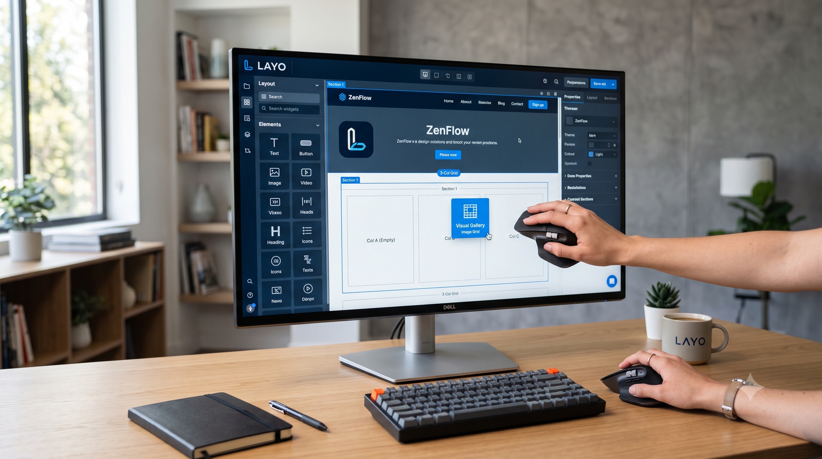
A Layout Builder transforms the page creation process from a code‑centric activity into a collaborative, visual experience. By following a structured workflow—starting with a clear blueprint, selecting appropriate templates, assembling a responsive grid, and populating it with well‑configured modules—teams can deliver custom pages that are fast, accessible, and on‑brand. Incorporating performance optimizations and accessibility checks ensures that the final product serves all users effectively. As organizations continue to prioritize digital experiences, mastering Layout Builder tools becomes an essential skill for designers, developers, and content strategists alike.
Introduction
Creating pages that reflect a brand’s identity while delivering a seamless user experience is a core responsibility for modern web professionals. A Layout Builder provides a visual framework that empowers designers and developers to assemble complex page structures without writing repetitive code. This article explores the principles behind Layout Builder tools, outlines a systematic workflow for building custom pages, and presents best practices that ensure performance, accessibility, and maintainability.
Understanding Layout Builder Fundamentals
What Is a Layout Builder?
A Layout Builder is a drag‑and‑drop interface that allows users to place predefined components—often called widgets, blocks, or modules—onto a canvas. The builder translates visual arrangements into markup and configuration files that the underlying content management system (CMS) or framework can render. By abstracting low‑level HTML and CSS, the tool accelerates prototyping and reduces the risk of coding errors.
Core Benefits
- Speed: Visual assembly eliminates the need to write repetitive markup.
- Consistency: Reusable components enforce design standards across the site.
- Collaboration: Designers and content editors can work together without deep technical knowledge.
- Scalability: Templates created with a Layout Builder can be duplicated and adapted for future projects.
Key Components of a Custom Page
A well‑structured custom page typically comprises the following elements:
- Header Region: Contains navigation, branding, and optional call‑to‑action elements.
- Hero Section: Large visual area that introduces the page’s purpose.
- Content Blocks: Text, images, videos, or interactive widgets arranged in rows or columns.
- **Sidebar (optional)**: Supplemental navigation, related links, or promotional content.
- Footer: Legal information, site map, and contact details.
Each component can be represented by a distinct module within the Layout Builder. Selecting the appropriate module type and configuring its settings determines the final appearance and behavior of the page.
Step‑by‑Step Workflow for Designing Custom Pages
1. Define the Page Blueprint
Before opening the builder, outline the page’s objectives, target audience, and required content elements. A simple checklist can guide this phase:
- Primary goal (e.g., lead generation, information dissemination)
- Key messages
- Required media assets
- Desired user actions
2. Choose a Base Template
Most Layout Builders ship with starter templates that include common regions such as header, footer, and grid structures. Selecting a template that aligns closely with the blueprint reduces the amount of custom configuration needed.
3. Assemble the Layout Grid
- Add rows to establish vertical sections.
- Within each row, insert columns to control horizontal distribution.
- Use responsive column settings to specify how the layout adapts to different screen sizes.
4. Populate Regions with Modules
For each grid cell, drag the appropriate module from the component library. Typical modules include:
- Text editor
- Image carousel
- Video embed
- Form block
- Call‑to‑action button
- Social feed
Configure each module’s properties, such as typography, spacing, and visibility rules. Many builders allow you to preview changes in real time, ensuring that the design meets expectations before publishing.
5. Apply Styling and Branding
While the Layout Builder handles structural layout, visual styling often requires additional steps:
- Assign CSS classes or select from predefined style sets.
- Upload brand assets (logos, color palettes) to the theme manager.
- Adjust spacing and alignment using the builder’s margin and padding controls.
6. Test Responsiveness and Interactivity
Use the builder’s device preview mode to verify that the page renders correctly on desktop, tablet, and mobile screens. Test interactive elements such as forms and sliders to confirm that they function as intended.
7. Optimize for Performance
- Compress images before uploading.
- Enable lazy loading for media-heavy sections.
- Minimize the number of active modules; unnecessary widgets increase page weight.
8. Conduct Accessibility Review
- Ensure all images have descriptive alt text.
- Verify sufficient color contrast between text and background.
- Check that interactive elements are reachable via keyboard navigation.
9. Publish and Monitor
Once the page passes quality checks, publish it to the live environment. Use analytics tools to monitor user engagement and identify areas for improvement.
Best Practices for Performance and Accessibility
Performance Checklist
- Asset Optimization: Use WebP or AVIF formats for images.
- Code Minification: Enable CSS and JavaScript minification in the CMS settings.
- Caching: Leverage browser caching for static assets.
- **Content Delivery Network (CDN)**: Serve media files from a CDN to reduce latency.
Accessibility Checklist
- Semantic HTML: Ensure that headings follow a logical hierarchy.
- ARIA Labels: Add ARIA attributes to custom widgets where necessary.
- Focus Management: Provide clear focus states for interactive elements.
- Skip Links: Include skip navigation links for screen‑reader users.
Adhering to these guidelines not only improves user experience but also contributes to better search engine rankings.
Advanced Techniques
Dynamic Content Integration
Many Layout Builders support dynamic data sources such as API feeds or database queries. By binding a module to a data endpoint, you can display up‑to‑date information without manual updates. For example, a “Latest News” block can pull headlines from a headless CMS and automatically refresh on each page load.
Conditional Rendering
Conditional logic allows modules to appear only under specific circumstances, such as when a user is logged in or when a particular URL parameter is present. This capability enables personalized experiences while keeping the page markup clean.
Custom Module Development
When the out‑of‑the‑box library does not meet a unique requirement, developers can create custom modules. The process typically involves:
1. Defining a module schema that describes configurable fields.
2. Implementing a render function that outputs the desired markup.
3. Registering the module with the Layout Builder’s component registry.
Custom modules extend the builder’s flexibility while preserving the visual editing workflow.
Conclusion
A Layout Builder transforms the page creation process from a code‑centric activity into a collaborative, visual experience. By following a structured workflow—starting with a clear blueprint, selecting appropriate templates, assembling a responsive grid, and populating it with well‑configured modules—teams can deliver custom pages that are fast, accessible, and on‑brand. Incorporating performance optimizations and accessibility checks ensures that the final product serves all users effectively. As organizations continue to prioritize digital experiences, mastering Layout Builder tools becomes an essential skill for designers, developers, and content strategists alike.