

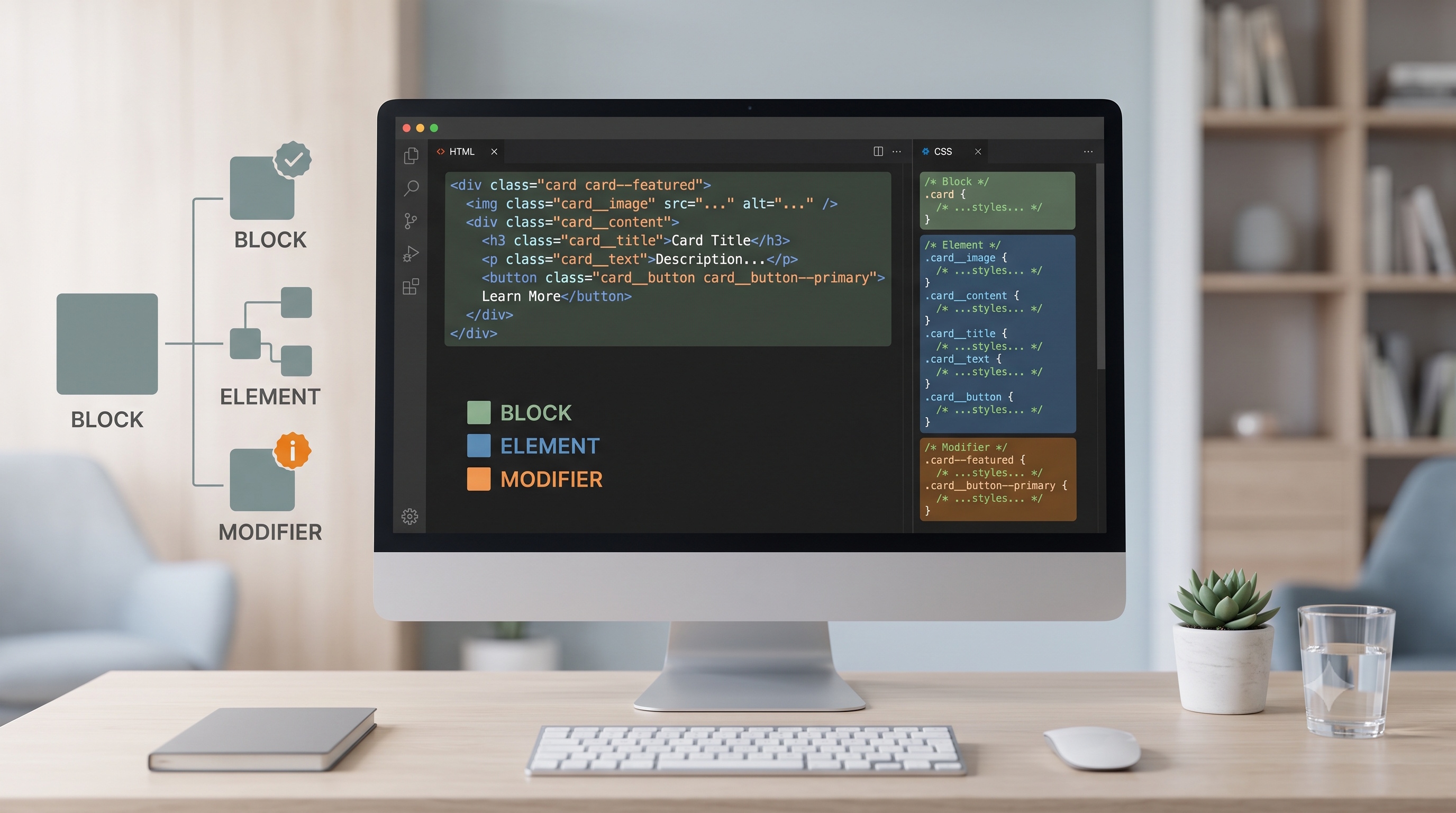
BEM provides a disciplined framework for writing CSS that scales with the complexity of modern web applications. By separating UI components into blocks, elements, and modifiers, developers gain clarity, reduce specificity conflicts, and improve collaboration across teams. Implementing BEM requires an upfront investment in naming conventions and documentation, but the payoff is a more maintainable codebase and faster development cycles. Whether you are building a single‑page application or a large corporate website, adopting BEM can bring order to your stylesheet and empower your team to deliver consistent, high‑quality user experiences.
Introduction
In modern web development, maintaining a scalable and maintainable stylesheet is a critical challenge. As projects grow, class names multiply, specificity battles intensify, and the risk of unintended side effects rises. The Block‑Element‑Modifier (BEM) methodology offers a systematic approach to naming and structuring CSS that mitigates these problems. By separating concerns into clearly defined blocks, elements, and modifiers, BEM creates a predictable hierarchy that works well with component‑based frameworks, design systems, and collaborative teams. This article provides a comprehensive guide to BEM, covering its core concepts, practical implementation steps, best practices, and common pitfalls.
Core Concepts of BEM
Block
A block represents an independent, reusable component of the user interface. It encapsulates all the markup and styling needed for that component. Examples include navigation menus, cards, buttons, and form fields.
Element
An element is a part of a block that has no meaning outside the context of that block. Elements are always tied to their parent block and cannot be used independently. Typical elements are icons inside a button, list items inside a menu, or labels inside a form field.
Modifier
A modifier describes a variation of a block or element. Modifiers can represent different states (active, disabled), visual themes (primary, secondary), or size variations (large, small). They are applied as additional classes that alter the appearance or behavior of the base block or element.
Naming Conventions
BEM uses a strict syntax that makes relationships explicit:
- Block: `block`
- Element: `block__element`
- Modifier: `block--modifier` or `block__element--modifier`
The double underscore (`__`) separates a block from its element, while the double hyphen (`--`) separates a block or element from its modifier. This syntax prevents accidental collisions and clarifies the role of each class.
Example
```html
<div class="card card--featured">
<h2 class="card__title">Featured Article</h2>
<p class="card__summary">A brief overview of the topic.</p>
<button class="card__button card__button--primary">Read More</button>
</div>
```
In this example:
- `card` is the block.
- `card__title`, `card__summary`, and `card__button` are elements.
- `card--featured` and `card__button--primary` are modifiers.
Benefits of Using BEM
- Predictable Structure: The hierarchy is explicit, making it easier for new developers to understand the stylesheet.
- Reduced Specificity Wars: BEM relies on flat class selectors, eliminating the need for deep nesting or `!important`.
- Improved Reusability: Blocks can be copied across projects with minimal adjustments.
- Better Collaboration: Clear naming reduces the chance of naming conflicts in large teams.
- Compatibility with Tools: BEM works seamlessly with CSS preprocessors, post‑processors, and component libraries.
Implementing BEM in a Project
1. Define a Component Inventory
Start by listing all UI components that will appear in the project. Group them into logical categories such as navigation, forms, cards, and alerts. This inventory becomes the foundation for your block definitions.
2. Establish Naming Guidelines
Create a style guide that documents:
- The exact syntax for blocks, elements, and modifiers.
- Rules for abbreviations and acronyms.
- Guidelines for when to create a new block versus extending an existing one.
3. Write Base Block Styles
For each block, write a base stylesheet that includes only the essential layout and visual rules. Avoid targeting elements directly with element selectors; instead, rely on the block’s class.
```css
/* Base card block */
.card {
background-color: #fff;
border-radius: 4px;
box-shadow: 0 2px 4px rgba(0,0,0,0.1);
padding: 16px;
}
```
4. Add Element Styles
Elements receive styles that are scoped to their parent block. Use the double‑underscore syntax to keep selectors flat.
```css
.card__title {
font-size: 1.25rem;
margin-bottom: 8px;
}
```
5. Apply Modifiers
Modifiers adjust the appearance or behavior of a block or element. Keep them lightweight and focused on a single change.
```css
.card--featured {
border-left: 4px solid #0070f3;
}
.card__button--primary {
background-color: #0070f3;
color: #fff;
}
```
6. Integrate with Preprocessors (Optional)
If you use Sass, Less, or Stylus, you can nest BEM selectors for readability while the compiled CSS remains flat.
```scss
.card {
&__title { ... }
&__button {
&--primary { ... }
}
&--featured { ... }
}
```
7. Test and Refine
Validate that each component works in isolation and within complex page layouts. Use visual regression tools to ensure that modifiers do not unintentionally affect unrelated elements.
Best Practices
- Keep Blocks Independent: Avoid referencing other blocks inside a block’s stylesheet.
- Limit Modifier Count: Use a small, well‑defined set of modifiers per block to prevent combinatorial explosion.
- Prefer Single‑Purpose Classes: Each class should serve one visual purpose; avoid mixing layout and theme concerns.
- Document Exceptions: If a deviation from the standard syntax is required, record the rationale in the style guide.
- Leverage Linting: Tools like stylelint can enforce BEM naming rules automatically.
Common Pitfalls and How to Avoid Them
- Over‑Nesting: Adding too many levels of elements (`block__element__subelement`) defeats the flat‑class goal. Keep the hierarchy shallow.
- Modifier Overload: Creating modifiers for every tiny variation leads to a bloated stylesheet. Consolidate similar states into a single modifier where possible.
- Inconsistent Naming: Switching between singular and plural forms, or mixing hyphens with underscores, creates confusion. Stick to the agreed convention.
- Mixing BEM with Global Styles: Global selectors like `h1` or `a` can unintentionally override BEM classes. Scope all visual rules to BEM classes whenever feasible.
- Neglecting Documentation: Without a living style guide, new team members may introduce conflicting naming patterns. Keep the guide up to date.
Integration with Component‑Based Frameworks
BEM aligns naturally with React, Vue, Angular, and similar libraries. When defining a component, the root element receives the block class, and child elements receive element classes. Props or state can be mapped to modifier classes.
```jsx
function Card({ featured, title, summary }) {
const block = 'card';
const modifier = featured ? `${block}--featured` : '';
return (
<div className={`${block} ${modifier}`}>
<h2 className="card__title">{title}</h2>
<p className="card__summary">{summary}</p>
<button className="card__button card__button--primary">Read More</button>
</div>
);
}
```
This pattern keeps the markup clean and the styling predictable, regardless of the framework’s rendering logic.
Case Study: Scaling a Marketing Site
A mid‑size SaaS company migrated its marketing site from a monolithic stylesheet to BEM. The project began with an audit of existing components, resulting in 32 distinct blocks. By applying BEM:
- CSS file size decreased by 18% after removing redundant selectors.
- The time required to locate a specific style dropped from minutes to seconds.
- New feature rollouts required fewer CSS changes because modifiers handled most visual variations.
The team also introduced a stylelint configuration that flagged any class name not matching the BEM pattern, ensuring long‑term consistency.
Conclusion
BEM provides a disciplined framework for writing CSS that scales with the complexity of modern web applications. By separating UI components into blocks, elements, and modifiers, developers gain clarity, reduce specificity conflicts, and improve collaboration across teams. Implementing BEM requires an upfront investment in naming conventions and documentation, but the payoff is a more maintainable codebase and faster development cycles. Whether you are building a single‑page application or a large corporate website, adopting BEM can bring order to your stylesheet and empower your team to deliver consistent, high‑quality user experiences.