
When designing a website, one of the most crucial decisions you'll make is choosing between a fluid and a fixed width layout. This decision can significantly impact the user experience, responsiveness, and overall performance of your website. In this article, we'll delve into the world of fluid and fixed width layouts, exploring their differences, advantages, and disadvantages, to help you make an informed decision for your next web project.
Introduction to Layouts
Before we dive into the specifics of fluid and fixed width layouts, it's essential to understand the basics of web page layouts. A web page layout refers to the arrangement of visual elements and content on a webpage. It encompasses the structure, organization, and presentation of text, images, videos, and other multimedia elements. A well-designed layout can enhance the user experience, improve navigation, and increase engagement.
What are Fixed Width Layouts?
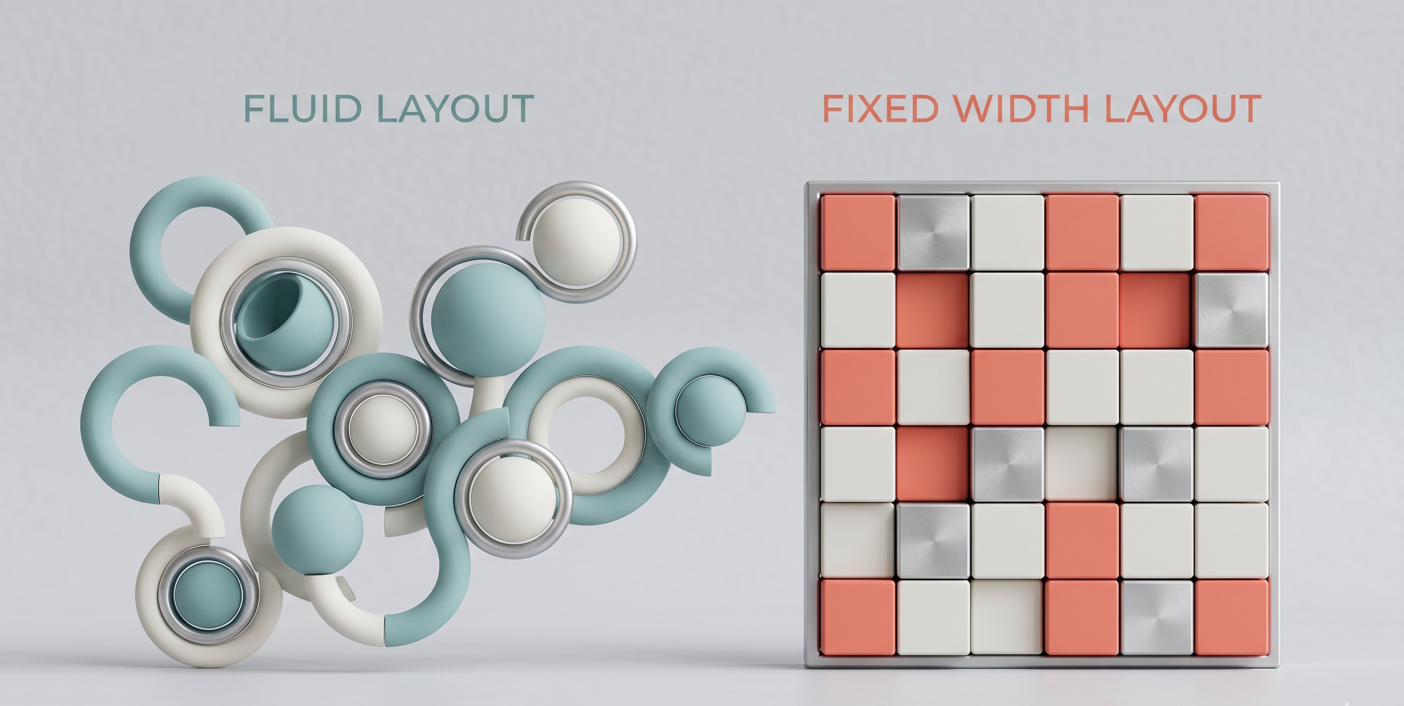
Fixed width layouts, also known as static or rigid layouts, have a fixed width that remains the same regardless of the screen resolution or device used to access the website. This means that the layout will not adapt to different screen sizes or devices, and the content will be centered or aligned to the left or right of the screen. Fixed width layouts were once the norm, particularly during the early days of web design, when screen resolutions were relatively standard.
Advantages of Fixed Width Layouts
Fixed width layouts have some advantages, including:
- Easier design and development: Fixed width layouts are often simpler to design and develop, as the layout remains consistent across different devices and screen resolutions.
- Better control over layout: With a fixed width layout, designers have more control over the layout, as the dimensions of the layout are fixed, and the content will always be displayed in the same way.
- Faster loading times: Fixed width layouts can result in faster loading times, as the browser doesn't need to spend time adjusting the layout to fit different screen sizes.
Disadvantages of Fixed Width Layouts
However, fixed width layouts also have some significant disadvantages, including:
- Limited responsiveness: Fixed width layouts are not responsive, meaning they will not adapt to different screen sizes or devices, which can result in a poor user experience on smaller or larger screens.
- Wasted screen space: On larger screens, fixed width layouts can result in wasted screen space, as the content will not expand to fill the available space.
- Difficulty with mobile devices: Fixed width layouts can be challenging to navigate on mobile devices, as the content may be too small or too large, and the layout may not be optimized for touch screens.
What are Fluid Width Layouts?
Fluid width layouts, also known as liquid or flexible layouts, have a width that adapts to the screen resolution or device used to access the website. This means that the layout will adjust to fit different screen sizes, and the content will be displayed in a way that is optimized for the device being used. Fluid width layouts are now the preferred choice for many web designers, as they offer a more flexible and responsive approach to web design.
Advantages of Fluid Width Layouts
Fluid width layouts have several advantages, including:
- Improved responsiveness: Fluid width layouts are responsive, meaning they will adapt to different screen sizes and devices, resulting in a better user experience across a range of devices.
- Optimized use of screen space: Fluid width layouts make the most of the available screen space, as the content will expand or contract to fit the screen size.
- Enhanced user experience: Fluid width layouts can result in an enhanced user experience, as the content will be displayed in a way that is optimized for the device being used.
Disadvantages of Fluid Width Layouts
However, fluid width layouts also have some disadvantages, including:
- More complex design and development: Fluid width layouts can be more challenging to design and develop, as the layout must adapt to different screen sizes and devices.
- Potential for inconsistent layout: If not designed carefully, fluid width layouts can result in an inconsistent layout, as the content may not be displayed in the same way across different devices.
- Potential for slower loading times: Fluid width layouts can result in slower loading times, as the browser must spend time adjusting the layout to fit different screen sizes.
Choosing Between Fluid and Fixed Width Layouts
When deciding between fluid and fixed width layouts, there are several factors to consider. If you're designing a website that will be accessed primarily on desktop devices, a fixed width layout may be a good choice. However, if you're designing a website that will be accessed on a range of devices, including mobile devices, a fluid width layout is likely a better option.
Considerations for Mobile Devices
When designing for mobile devices, it's essential to consider the unique challenges and opportunities of mobile design. Mobile devices have smaller screens, and users often interact with websites using touch screens. A fluid width layout can help to ensure that your website is optimized for mobile devices, with content that is easy to read and navigate.
Considerations for Accessibility
When designing a website, it's also essential to consider accessibility. A fluid width layout can help to ensure that your website is accessible to users with disabilities, as the content will be displayed in a way that is optimized for screen readers and other assistive technologies.
Conclusion
In conclusion, the choice between fluid and fixed width layouts depends on your specific needs and goals. While fixed width layouts offer a more traditional approach to web design, fluid width layouts provide a more flexible and responsive approach. By considering the advantages and disadvantages of each option, you can make an informed decision that meets the needs of your website and your users. Whether you choose a fluid or fixed width layout, the key is to design a website that provides a great user experience, with content that is easy to read, navigate, and engage with. By prioritizing the needs of your users and staying up-to-date with the latest web design trends and best practices, you can create a website that is effective, efficient, and enjoyable to use.