
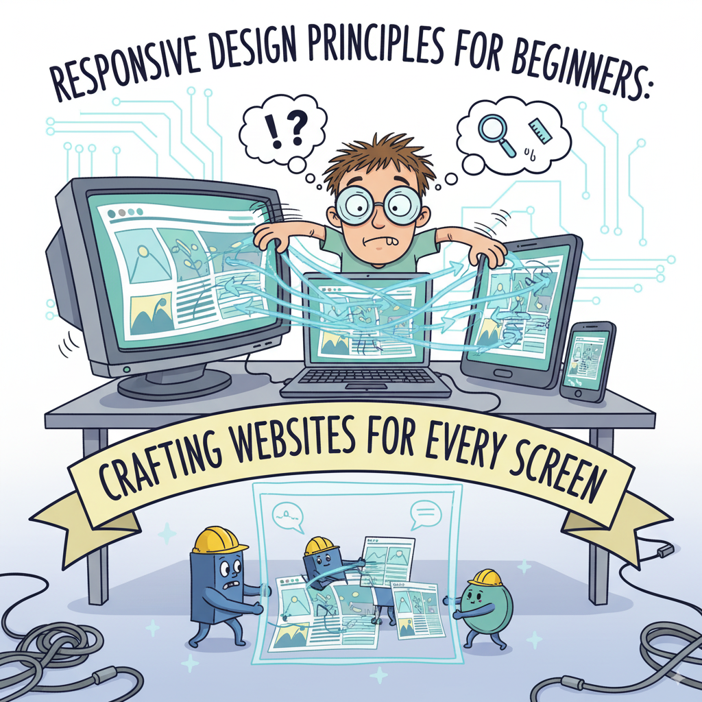
Responsive design is a crucial approach for creating websites that provide an optimal viewing experience across a wide range of devices, from mobile phones to large desktop monitors. It addresses the frustration users experience when a website built for a single screen size is difficult to navigate or read on other devices, leading to missed opportunities for website owners.
Why Responsive Design is Essential Today
Responsive design is now non-negotiable due to several key factors:
• Mobile-First Reality: Over 50% of global web traffic comes from mobile devices, and users expect websites to function flawlessly on their phones. Google reinforces this by using mobile versions of sites for ranking through “mobile-first indexing,” making mobile-friendliness a necessity for search visibility.
• User Experience (UX) Impact: A site that is easy to use on any device keeps visitors engaged longer, reducing bounce rates and increasing conversion rates (e.g., purchases or sign-ups). Good responsive design enhances brand perception and user satisfaction.
• Search Engine Optimization (SEO) Benefits: Google openly prefers responsive websites, making it a key factor in search rankings. A single responsive site with one URL is simpler for search engines to crawl and index than separate desktop and mobile versions, often leading to faster site speeds, another SEO benefit.
Core Principles of Responsive Design
The foundation of responsive design rests on three main principles:
• Fluid Grids: This involves using flexible, percentage-based measurements instead of fixed pixels for layout elements. This allows components like text columns or image containers to stretch or shrink proportionally to the screen width, often built upon a 12-column grid system.
• Flexible Images and Media: Images and videos must also adapt to screen size. Simple CSS like max-width: 100%; and height: auto; ensures images scale within their containers while maintaining aspect ratios. Advanced techniques like the <picture> element or srcset attribute help browsers select optimal image sizes for faster loading.
• Media Queries: These are special CSS rules that apply different styles based on device characteristics, such as screen width. They use “breakpoints” (specific screen widths) to change layout, hide elements, or adjust fonts. A common practice is to design for phones first and then use media queries to add styles for larger screens.
Essential Responsive Design Techniques
Beginners should adopt these techniques:
• Mobile-First Approach: Start designing and building for the smallest screens, prioritizing essential content and features. This simplifies design and often results in faster loading times for mobile users, with additional elements and styles added for larger screens later via media queries.
• Viewport Meta Tag: This crucial HTML tag tells mobile browsers how to scale the page. Including <meta name="viewport" content="width=device-width, initial-scale=1.0"> ensures the page width matches the device width and sets the initial zoom level, making media queries function correctly.
• Touch Targets and Navigation: Buttons and links on touchscreens need to be large enough (Google suggests at least 48 pixels wide and tall) and have sufficient spacing to prevent accidental taps. Navigation often employs “hamburger menus” on smaller screens to save space.
Responsive design is an indispensable skill for building modern websites, ensuring a positive user experience, boosting SEO, and future-proofing web projects.
Conclusion
Responsive design is not merely a trend; it is how modern websites must be built. It is essential for ensuring a great experience for everyone, significantly boosting your SEO, and helping your business thrive online.
To effectively implement responsive design, it is crucial to remember the core principles: fluid grids, flexible media, and media queries. Always approach your designs with a mobile-first mindset. Beginning to incorporate these principles into your web projects today is a wise step, as responsive design is a skill you will continue to learn and perfect, representing a real investment in making your websites ready for the future.
For a deeper dive into the technical details and practical examples, check out the official Read more on MDN: Responsive Design. It’s an excellent resource for expanding your understanding beyond the basics covered here.