
In today's digital landscape, mobile devices have become the primary means of accessing the internet. With the proliferation of smartphones and tablets, it's no longer sufficient to simply optimize websites for desktop computers. Instead, designers must adopt a mobile-first approach, prioritizing the user experience on smaller screens. In this article, we'll explore the principles and best practices of mobile-first design, and discuss how to create effective, user-friendly interfaces for mobile devices.
Introduction to Mobile-First Design
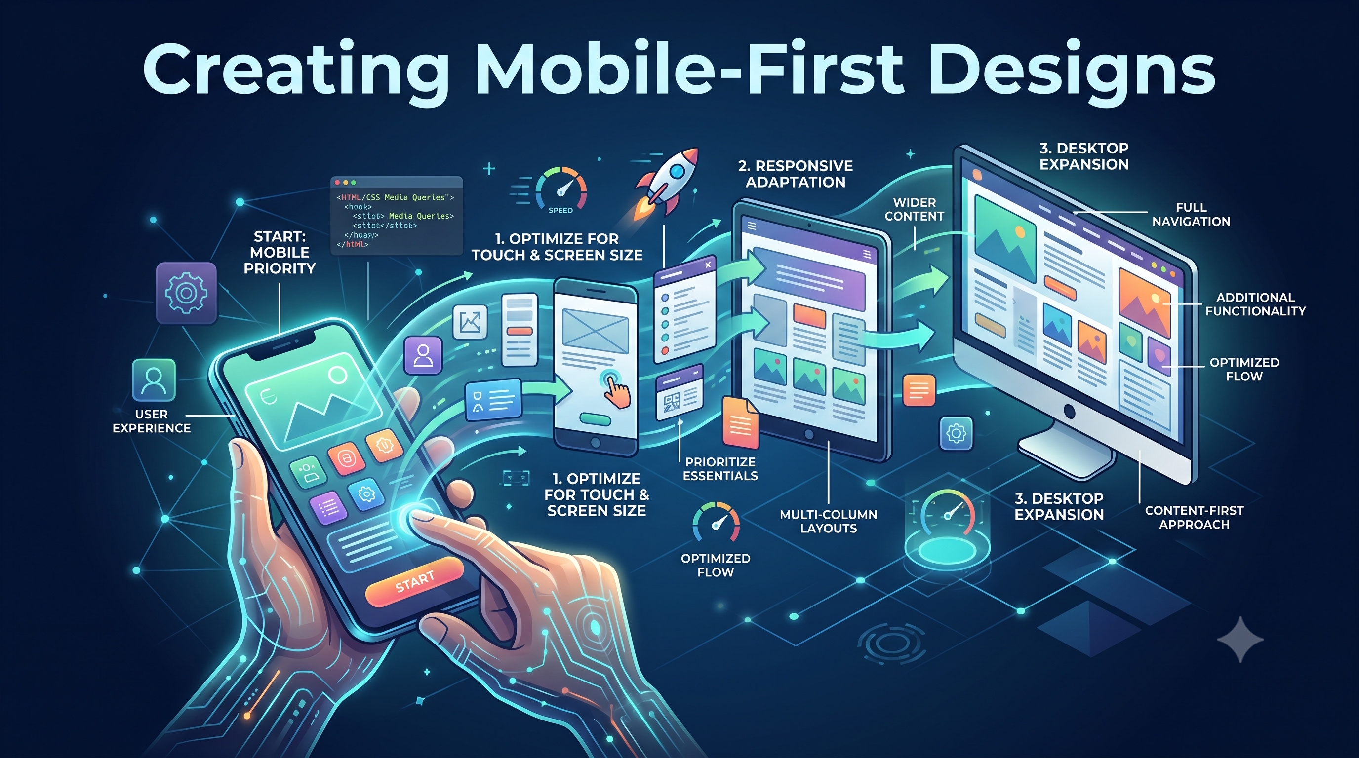
Mobile-first design is an approach to web design that involves designing for mobile devices first, and then adapting the design for larger screens. This approach is based on the idea that mobile devices have limited screen real estate, processing power, and bandwidth, which requires designers to be more intentional and efficient in their design decisions. By designing for mobile first, designers can ensure that their website or application is optimized for the majority of users, who access the internet through mobile devices.
Benefits of Mobile-First Design
The benefits of mobile-first design are numerous. Some of the most significant advantages include:
- Improved user experience: By designing for mobile devices first, designers can create interfaces that are tailored to the unique characteristics of mobile devices, such as touch screens and limited screen real estate.
- Increased conversions: Mobile-first design can lead to higher conversion rates, as users are more likely to engage with a website or application that is optimized for their device.
- **Better search engine optimization (SEO)**: Google and other search engines prioritize mobile-friendly websites in their search results, which means that mobile-first design can improve a website's visibility and ranking.
Principles of Mobile-First Design
So, what are the key principles of mobile-first design? Here are some of the most important considerations:
- Simple and intuitive navigation: Mobile devices have limited screen real estate, which means that navigation menus and other interface elements must be simple and easy to use.
- Prominent calls-to-action: Calls-to-action (CTAs) should be prominent and easy to tap, as mobile users are often looking for a quick and easy way to complete a task.
- Large touch targets: Interface elements, such as buttons and form fields, should be large enough to be easily tapped with a finger.
- Fast loading times: Mobile devices often have limited bandwidth and processing power, which means that websites and applications must load quickly to provide a good user experience.
Designing for Mobile Devices
When designing for mobile devices, it's essential to consider the unique characteristics of these devices. Here are some tips for designing effective mobile interfaces:
- Use a single-column layout: Single-column layouts are often more effective on mobile devices, as they allow users to easily scroll through content without having to navigate multiple columns.
- Use large font sizes: Large font sizes can help to improve readability on mobile devices, which often have smaller screens than desktop computers.
- Use high-contrast colors: High-contrast colors can help to improve visibility on mobile devices, which may be used in a variety of lighting conditions.
Implementing Mobile-First Design
So, how can designers implement mobile-first design in their work? Here are some steps to follow:
1. Start with a mobile wireframe: Begin by creating a wireframe of your website or application on a mobile device. This will help you to identify the most important elements of your interface and prioritize them accordingly.
2. Design for touch: Mobile devices are touch-based, which means that designers must consider the size and placement of interface elements, such as buttons and form fields.
3. Test on multiple devices: Test your design on multiple devices, including smartphones and tablets, to ensure that it works well across different screen sizes and devices.
4. Iterate and refine: Iterate on your design based on user feedback and testing results, refining your design to ensure that it meets the needs of your users.
Tools and Resources for Mobile-First Design
There are many tools and resources available to help designers implement mobile-first design. Some popular options include:
- Sketch and Figma: These digital design tools allow designers to create and prototype mobile interfaces quickly and easily.
- Adobe XD: This user experience design software provides a range of tools and features for designing and prototyping mobile interfaces.
- InVision: This design platform provides a range of tools and features for designing, prototyping, and testing mobile interfaces.
Conclusion
Creating mobile-first designs is essential in today's digital landscape, where mobile devices are the primary means of accessing the internet. By prioritizing the user experience on smaller screens, designers can create effective, user-friendly interfaces that meet the needs of their users. By following the principles and best practices outlined in this article, designers can ensure that their websites and applications are optimized for mobile devices, providing a better user experience and improving conversions and search engine optimization. Whether you're a seasoned designer or just starting out, mobile-first design is an essential skill to have in your toolkit.