

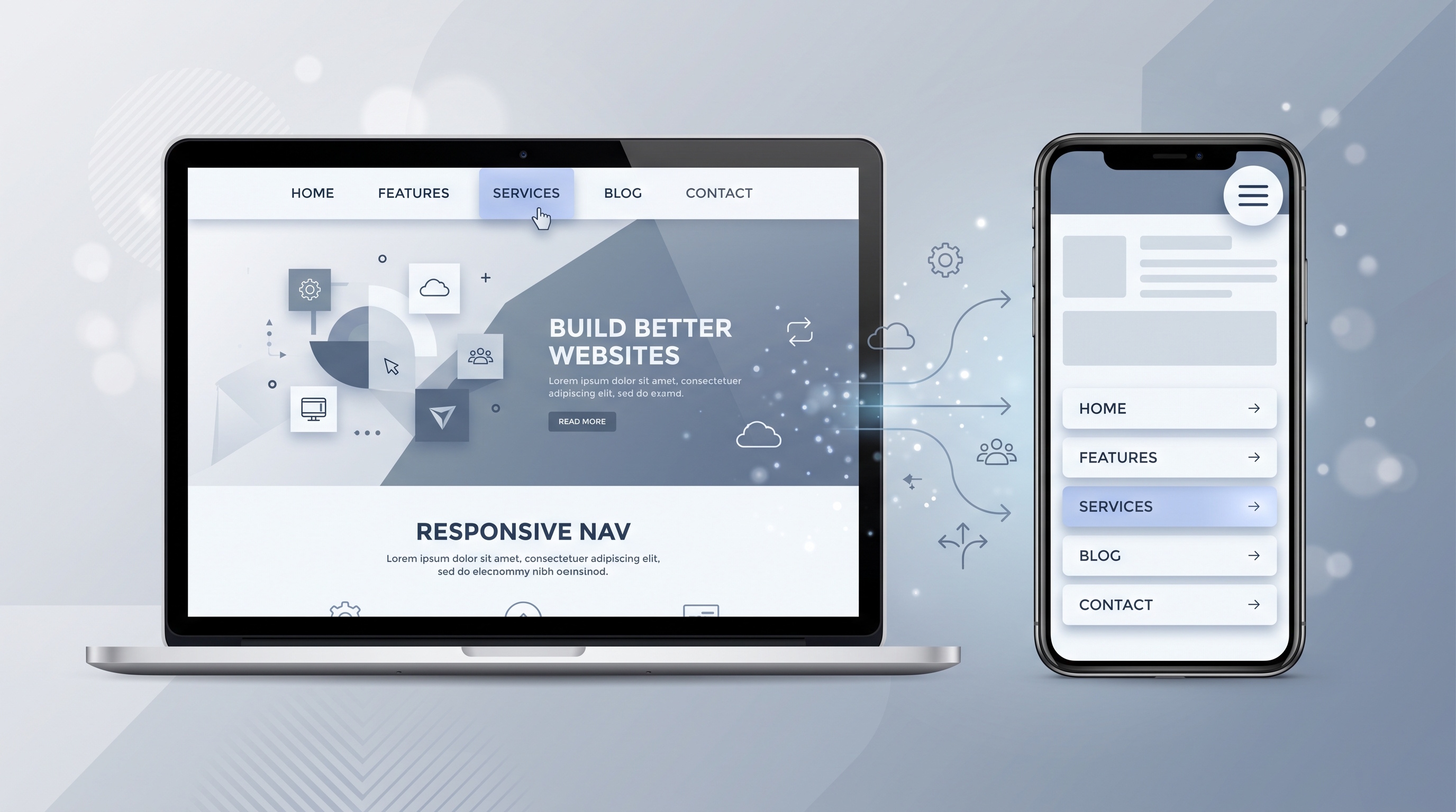
Making a menu responsive takes more than squishing a desktop bar onto a smaller display. You need flexbox or grid layouts, large tap targets, clear keyboard controls, and sensible fallback styling. By combining clean HTML, straightforward CSS, and a small snippet of JavaScript, you can build a menu that is fast, accessible, and painless to use on any device.
Introduction
A navigation menu is how people find their way around a website. When it adapts smoothly across screen sizes, users stay longer, bounce less, and search engines take notice. This guide breaks down how responsive navigation works, walks through a step-by-step setup, and covers practical tips for speed and accessibility. It is written for developers, designers, and team leads who need a menu that works reliably on everything from phones to large monitors.
Understanding Responsive Navigation
Why responsiveness matters
- Mobile traffic now exceeds desktop traffic for most content sites.
- Users expect instant access to key pages regardless of device orientation.
- Search engines prioritize mobile‑friendly pages in ranking algorithms.
Because of this, your navigation needs to adjust its layout, touch targets, and visual layout based on the device being used.
Core Principles of a Responsive Menu
Fluid layout
- Use relative units such as percentages, viewport width (vw), and flexbox to let the menu expand or contract with the viewport.
- Avoid fixed pixel widths for containers that hold navigation links.
Touch‑friendly design
- Set a minimum tap target size of 48 px by 48 px so links are easy to hit with a thumb.
- Increase spacing between links on small screens to prevent accidental activation.
Progressive disclosure
- Display the full menu on desktop screens.
- Collapse sub-items into a menu icon or slide-out menu on smaller screens.
Consistent branding
- Keep colors, fonts, and icons consistent with your site visual design across every screen size.
Step‑by‑Step Implementation
1. Define the HTML structure
```html
<nav class="site-nav" aria-label="Main navigation">
<button class="nav-toggle" aria-expanded="false" aria-controls="nav-list">
<span class="sr-only">Menu</span>
<svg aria-hidden="true" viewBox="0 0 100 80" width="30" height="30">
<rect width="100" height="15"></rect>
<rect y="30" width="100" height="15"></rect>
<rect y="60" width="100" height="15"></rect>
</svg>
</button>
<ul id="nav-list" class="nav-list">
<li><a href="/">Home</a></li>
<li><a href="/about">About</a></li>
<li><a href="/services">Services</a></li>
<li><a href="/contact">Contact</a></li>
</ul>
</nav>
```
- The `<nav>` element provides semantic meaning.
- The toggle button controls visibility of the list on small screens.
- The `aria-expanded` attribute reflects the open or closed state for assistive technologies.
2. Apply CSS for layout
```css
/* Base styles */
.site-nav {
display: flex;
align-items: center;
justify-content: space-between;
padding: 0.5rem 1rem;
background: #ffffff;
border-bottom: 1px solid #e0e0e0;
}
/* Hide toggle on large screens */
.nav-toggle {
background: none;
border: none;
cursor: pointer;
display: none;
}
/* Horizontal list for wide viewports */
.nav-list {
display: flex;
list-style: none;
margin: 0;
padding: 0;
}
/* Link styling */
.nav-list a {
display: block;
padding: 0.5rem 1rem;
text-decoration: none;
color: #333333;
}
/* Responsive breakpoint */
@media (max-width: 768px) {
.nav-toggle {
display: block;
}
.nav-list {
position: absolute;
top: 100%;
left: 0;
right: 0;
flex-direction: column;
background: #ffffff;
max-height: 0;
overflow: hidden;
transition: max-height 0.3s ease;
}
.nav-list.open {
max-height: 500px; /* enough to show all items */
}
.nav-list a {
padding: 1rem;
}
}
```
- Flexbox creates a fluid horizontal layout on large screens.
- The media query stacks items vertically and reveals the toggle button on screens under 768 px.
- Animating `max-height` gives you a smooth slide-down effect without needing JavaScript height calculations.
3. Add JavaScript for interactivity
```js
document.addEventListener('DOMContentLoaded', function () {
const toggle = document.querySelector('.nav-toggle');
const menu = document.getElementById('nav-list');
toggle.addEventListener('click', function () {
const expanded = toggle.getAttribute('aria-expanded') === 'true';
toggle.setAttribute('aria-expanded', !expanded);
menu.classList.toggle('open');
});
// Close menu when clicking outside
document.addEventListener('click', function (e) {
if (!menu.contains(e.target) && !toggle.contains(e.target)) {
toggle.setAttribute('aria-expanded', 'false');
menu.classList.remove('open');
}
});
});
```
- The script toggles the `open` class and updates `aria-expanded` to keep screen readers in sync.
- An extra click listener closes the menu when a user taps outside of it.
4. Test across devices
- Use Chrome DevTools device toolbar to emulate smartphones, tablets, and desktops.
- Verify that the toggle button is keyboard focusable and that pressing `Enter` or `Space` activates it.
- Run automated accessibility audits (e.g., Lighthouse, axe) to catch missing ARIA attributes or color contrast issues.
Common Pitfalls and How to Avoid Them
- Fixed widths: Swap out fixed pixel values like `width: 200px` for flexible units like `max-width: 100%` or flexbox rules.
- Hover-only menus: Touchscreens do not have a hover state, so make sure sub-menus open on tap or click.
- Deeply nested markup: Keep your navigation structure simple. Too many sub-levels quickly break on mobile screens.
- Neglecting focus styles: Ensure visible focus outlines for keyboard users.
Performance and Accessibility Considerations
- Minify CSS and JavaScript to reduce payload size.
- Load icons as inline SVG to avoid additional HTTP requests.
- Use `prefers-reduced-motion` media query to disable animations for users who have requested minimal motion.
- Add a skip link: Include a "Skip to content" link at the top so screen reader and keyboard users can bypass navigation on every page reload.
- Test color contrast against WCAG AA standards; aim for a minimum ratio of 4.5:1 for normal text.
Conclusion
Making a menu responsive takes more than squishing a desktop bar onto a smaller display. You need flexbox or grid layouts, large tap targets, clear keyboard controls, and sensible fallback styling. By combining clean HTML, straightforward CSS, and a small snippet of JavaScript, you can build a menu that is fast, accessible, and painless to use on any device.