

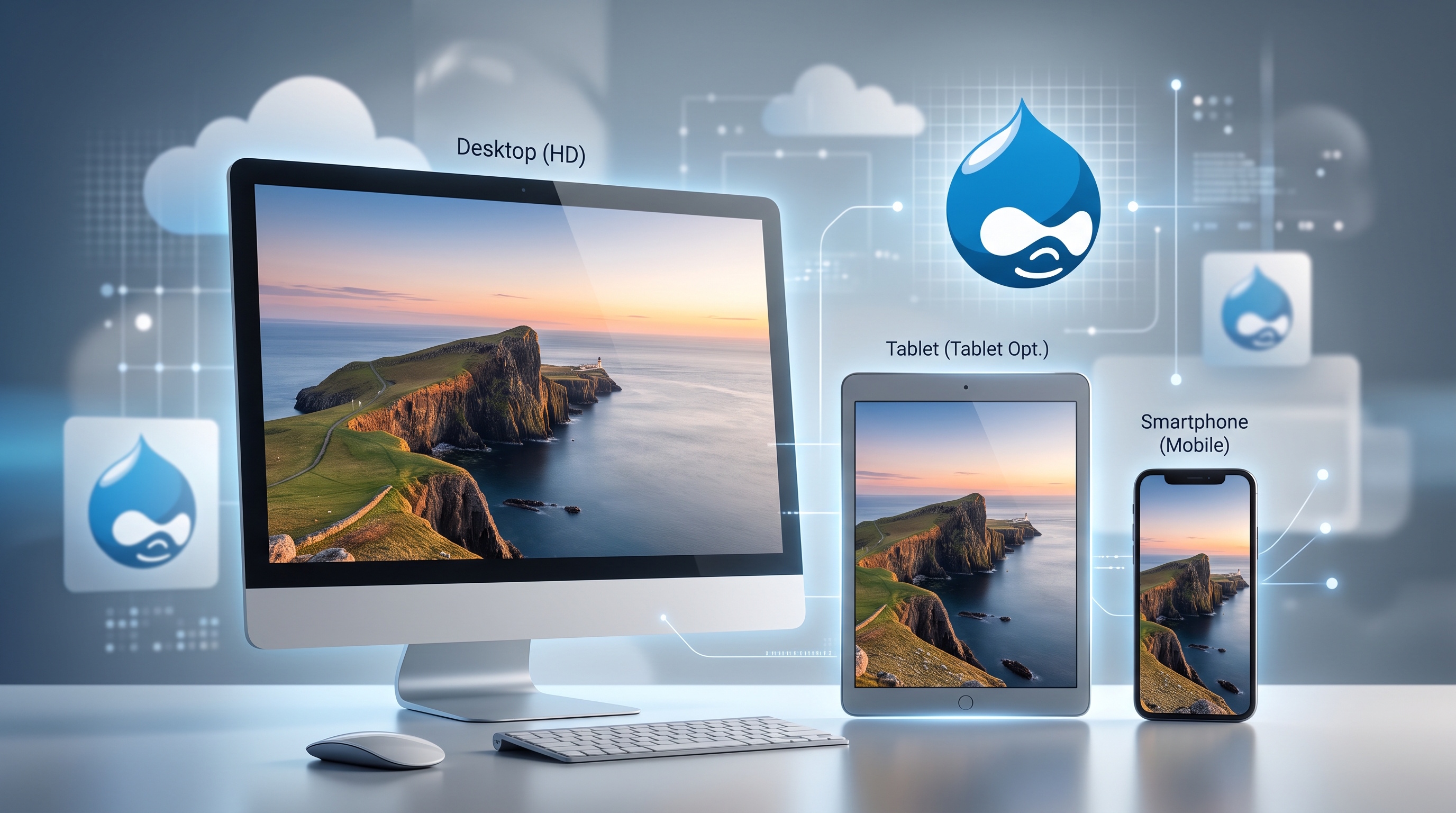
Responsive images are standard in web design now. Screen sizes vary widely, from high-resolution desktop monitors to small phones. Serving appropriately sized images keeps your site fast, accessible, and easy to use. Drupal handles responsive images natively through core features and configuration, so you rarely need custom code. Here is how its setup works, from configuration and themes to performance and future updates.
Understanding Responsive Images
Responsive images let browsers choose the best image variant based on the user's screen size, pixel density, and connection speed. Mobile users get smaller files, while desktop users see sharp, full-resolution versions. This saves bandwidth, speeds up page loads, and improves search rankings.
Why Responsive Images Matter
- Faster page loads keep visitors on your site longer, especially on slow mobile connections.
- Lower data usage cuts down server overhead and hosting costs.
- High-density displays display sharp visuals automatically without forcing extra file weight onto smaller devices.
- Properly formatted media fits web accessibility standards better.
- Search engines rank fast-loading pages higher.
Drupal Core Features for Responsive Images
Drupal connects a few core components to handle images automatically:
- Responsive Image module: maps image styles to specific breakpoints.
- Image Styles: generate cropped or resized copies with set dimensions, effects, and formats.
- Breakpoints module: defines the screen size ranges that trigger different styles.
- Layout Builder and Media Library: give content editors a clean UI to pick and place images.
When an editor uploads an image, Drupal uses your breakpoint mappings to output the proper HTML markup with standard `srcset` and `sizes` attributes. The browser reads these attributes and downloads only the best matching file size.
Configuring Responsive Image Styles
1. Define screen size ranges in your theme's `breakpoints.yml` file, or add custom ranges through the UI.
2. Create image styles for each screen size, such as mobile thumbnails, tablet medium sizes, and desktop large sizes.
3. Open Configuration → Media → Responsive Image Styles and pair every breakpoint with its matching image style.
4. Assign the responsive image style to a field display or a view mode.
5. Clear caches to ensure the new mappings are recognized by the rendering engine.
Integrating Responsive Images with Themes
Theme developers output responsive images directly in Twig templates. Drupal's `responsive_image` function creates the markup for you, while frontend libraries can add native lazy loading or fallback scripts where needed.
Best Practices for Theme Developers
- Use the `responsive_image` Twig function instead of writing raw HTML `<img>` tags.
- Centralize layout logic by declaring breakpoint groups inside `breakpoints.yml`.
- Match your CSS media queries with your breakpoint settings to avoid layout shifts during load.
- Enable lazy loading by default using `loading="lazy"` on image attributes.
- Test delivery across various screen sizes using browser developer tools and network throttling.
Performance Considerations
While responsive images speed up load times on the client side, they require smart caching set up on the server. Proper configuration prevents your server from spending extra computing power generating duplicate copies unnecessarily.
Tools and Modules for Optimization
- Image Optimize: compresses image files without losing visible quality.
- CDN Integration (Fastly or Cloudflare): stores generated variants close to users, cutting down origin server hits.
- Lazyloader: delays loading off-screen images until visitors scroll near them.
- Responsive Image Styles UI: gives you a clear visual dashboard to spot and remove unused image styles.
Real‑World Use Cases
- Online stores: show small thumbnails in mobile galleries and detailed, high-resolution photos on desktop screens.
- News sites: resize header graphics dynamically for phones without breaking article formatting.
- Internal portals: fit profile avatars to employee directory layouts without overloading network bandwidth.
Future Directions
Drupal core continues to refine how it handles media assets. Recent updates and plans focus on:
- Generating WebP and AVIF formats automatically for supporting browsers.
- Expanding `<picture>` element support to make art direction easier.
- Integrating responsive settings directly into the Media Library interface.
- Adding diagnostics to help site admins clean up unused image styles and breakpoints.
These improvements automate routine maintenance while keeping Drupal sites fast and lightweight.
Conclusion
Drupal gives developers and site builders a complete set of tools for serving responsive images across different devices. By pairing core modules with clean breakpoint setups, you can cut page load times and trim bandwidth costs without adding unnecessary complexity.