

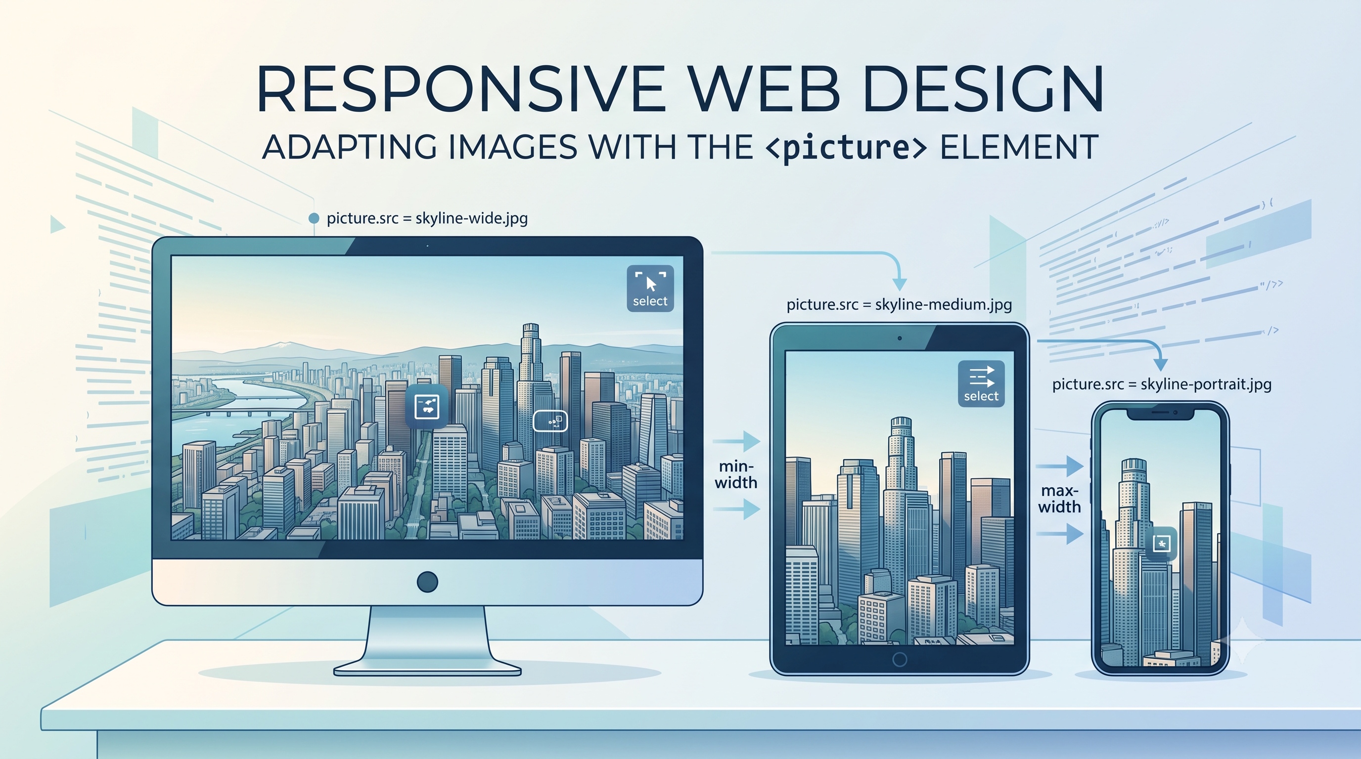
Responsive design is no longer optional; it is a baseline expectation for modern web experiences. One of the most visible aspects of a responsive site is how images adapt to different screen sizes, resolutions, and device capabilities. The HTML `<picture>` element, together with `<source>` and `srcset`, provides a standards‑based solution that gives developers fine‑grained control over which image variant is delivered. This article explains the purpose of the `<picture>` element, walks through its syntax, explores advanced scenarios, and offers practical guidance for performance, testing, and deployment.
Understanding Responsive Images
Responsive images aim to serve the most appropriate visual asset for each user context. The goals are threefold:
- Reduce unnecessary bandwidth consumption by avoiding oversized files on small screens.
- Preserve visual quality on high‑density displays by delivering higher‑resolution assets when needed.
- Enable art direction, allowing different crops or compositions to appear based on viewport dimensions.
Traditional approaches, such as CSS background images or JavaScript‑driven swaps, often lack semantic meaning and can hinder accessibility. The `<picture>` element addresses these shortcomings by embedding image selection logic directly in the markup, allowing browsers to make decisions early in the rendering pipeline.
Why the `<picture>` element matters
- Semantic clarity – The element communicates intent to browsers, screen readers, and search engines.
- Native browser support – Modern browsers evaluate media queries and type attributes without extra scripts.
- Graceful degradation – If a browser does not understand `<picture>`, it falls back to the nested `<img>` element.
- Art direction flexibility – Different image files can be chosen for the same viewport based on aspect ratio or content focus.
Syntax and Core Attributes
The basic structure consists of a `<picture>` container, one or more `<source>` elements, and a fallback `<img>` element.
```html
<picture>
<source srcset="hero-small.webp 600w, hero-medium.webp 1200w"
sizes="(max-width: 600px) 100vw, 50vw"
type="image/webp">
<source srcset="hero-small.jpg 600w, hero-medium.jpg 1200w"
sizes="(max-width: 600px) 100vw, 50vw"
type="image/jpeg">
<img src="hero-fallback.jpg"
alt="A panoramic view of the city skyline at sunset"
loading="lazy">
</picture>
```
Key attributes:
- srcset – Lists image URLs with optional width (`w`) or pixel density (`x`) descriptors.
- sizes – Informs the browser how much space the image will occupy under different viewport conditions.
- media – A media query that determines when a particular `<source>` is eligible.
- type – The MIME type of the image; useful for serving modern formats like WebP when supported.
Basic example explained
1. The first `<source>` offers WebP images for browsers that support the format.
2. The second `<source>` provides JPEG alternatives for browsers lacking WebP support.
3. The `<img>` element supplies a fallback URL and the `alt` text required for accessibility.
When the viewport width is 600 px or less, the browser selects the 600 w variant; otherwise it chooses the 1200 w version. The `loading="lazy"` attribute defers off‑screen images, improving initial page load time.
Advanced Use Cases
Responsive images are not limited to simple size swaps. The `<picture>` element enables sophisticated scenarios that enhance visual storytelling and performance.
- Art direction – Different crops or compositions can be displayed on mobile versus desktop.
- Format fallback – Modern formats (AVIF, WebP) can be prioritized while retaining JPEG or PNG as backups.
- Orientation handling – Separate assets for portrait and landscape orientations improve layout stability.
Art direction in practice
```html
<picture>
<source media="(min-width: 1024px)" srcset="hero-desktop.jpg">
<source media="(max-width: 1023px)" srcset="hero-mobile.jpg">
<img src="hero-fallback.jpg" alt="Mountain landscape with sunrise">
</picture>
```
In this example, a wide panoramic image is served to desktop users, while a tighter vertical crop appears on tablets and phones. The approach eliminates the need for CSS cropping, preserving the photographer’s intended framing.
Format fallback strategy
```html
<picture>
<source type="image/avif" srcset="hero.avif">
<source type="image/webp" srcset="hero.webp">
<img src="hero.jpg" alt="City street at night">
</picture>
```
The browser evaluates each `<source>` in order. If AVIF support is present, the first source is used; otherwise the WebP source is considered. If neither modern format is supported, the JPEG fallback is displayed.
Performance Considerations
Delivering the right image at the right time is only part of the equation. Performance‑focused developers should adopt additional best practices.
- Compress assets – Use lossless or lossy compression tools appropriate for the target format.
- Leverage CDN edge caching – Store each variant on a content delivery network to reduce latency.
- Set explicit width and height – Prevent layout shift by reserving space for the image before it loads.
- Combine with `loading="lazy"` – Defer off‑screen images to prioritize above‑the‑fold content.
Browser Support and Polyfills
All major browsers, including Chrome, Edge, Firefox, Safari, and Opera, support the `<picture>` element and its associated attributes. Legacy browsers such as Internet Explorer 11 lack native support, but graceful degradation ensures the fallback `<img>` is displayed. For projects that must accommodate older environments, a lightweight polyfill (e.g., picturefill) can be added without impacting modern browsers.
Testing and Debugging
Ensuring that the correct image variant is served across devices requires systematic testing.
- Responsive design mode – Use Chrome DevTools or Firefox Responsive Design View to simulate viewport widths and device pixel ratios.
- Network throttling – Emulate slower connections to verify that lazy loading and compression behave as expected.
- Resource inspection – Check the “Headers” tab to confirm the MIME type and caching directives of each request.
- Accessibility audit – Verify that every `<img>` includes meaningful `alt` text and that decorative images use empty `alt` attributes.
Common Pitfalls
- Missing `alt` attribute – Neglecting alternative text harms accessibility and SEO.
- Over‑specifying `srcset` – Providing too many variants can increase page weight without measurable benefit.
- Incorrect `sizes` syntax – An inaccurate `sizes` value may cause the browser to download a larger file than necessary.
- Forgetting width/height – Omitting these attributes leads to cumulative layout shift, degrading user experience.
Addressing these issues early in development saves time and improves the overall quality of the site.
Conclusion
The `<picture>` element is a powerful, standards‑based tool for delivering responsive images that respect device capabilities, bandwidth constraints, and artistic intent. By mastering its syntax, leveraging format fallback, and adhering to performance best practices, developers can create visually rich experiences that load quickly and remain accessible. Regular testing across browsers and devices, combined with thoughtful asset management, ensures that the right image reaches the right user every time.