
CSS Grid Layout is a modern, powerful system for creating two-dimensional web layouts using rows and columns. It gives developers precise control over the placement, alignment, and spacing of elements without relying on complex floats or extra wrapper divs. With simple, flexible properties, Grid makes it easier to build clean, responsive designs that adapt to any screen size.
A Brief History
CSS Grid is a relatively new layout system for the web, officially standardized around 2017. Before Grid, developers used float, inline-block, or Flexbox to create complex layouts. While these techniques work, they often required extra wrappers and complicated hacks to manage both rows and columns. Grid was introduced to simplify two-dimensional layouts, making it easier to align content both vertically and horizontally.
Key Features and Benefits
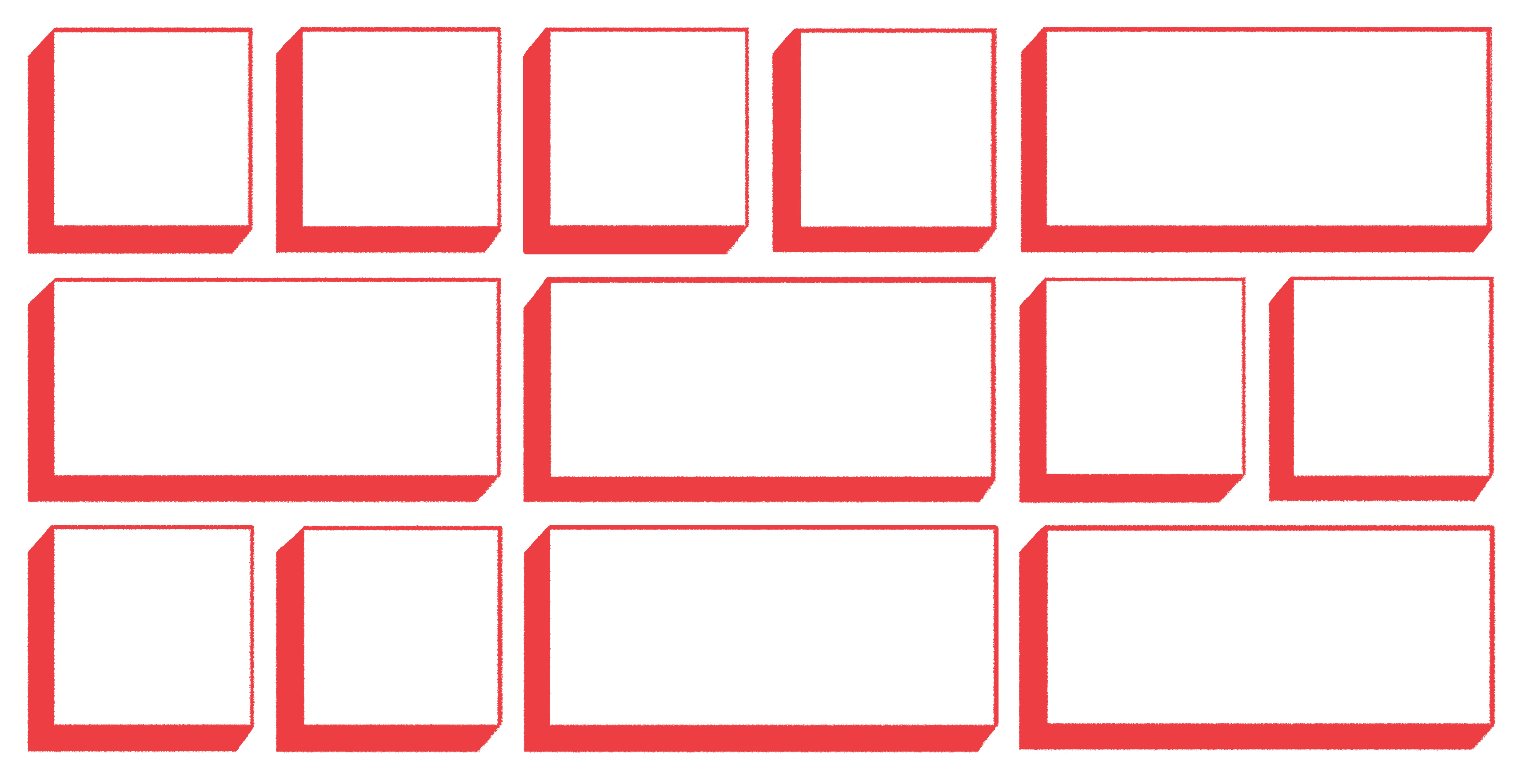
CSS Grid Layout is a powerful tool that allows developers to divide a page into rows and columns and place content precisely where it’s needed. Unlike Flexbox, which primarily works in one dimension (either row or column), Grid handles both rows and columns simultaneously, giving you a more complete layout system.
- Two-dimensional layout: Easily align content both vertically and horizontally.
- Explicit positioning: Place elements exactly where you want them using line numbers or names.
- Responsive design: Use
fr,minmax(),auto-fit, andauto-fillto create adaptable layouts. - Simpler markup: Reduces the need for extra wrapper
<div>elements compared to older layout methods. - Alignment and spacing: Control layout with properties like
justify-items,align-items, andgap.
Basic Terminology
To use CSS Grid effectively, it’s helpful to understand a few key terms:
- Grid container: The parent element with
display: grid;. - Grid items: The direct children of the container.
- Tracks: The rows and columns in the grid.
- Cells / Areas: The boxes formed by the intersection of rows and columns.
- Line numbers / named lines: Can position items by line numbers or custom names.
Basic CSS Grid Syntax
To create a simple grid container and define columns and rows:
/* Create a 3-column grid with gaps */.container {
display: grid;
grid-template-columns: 1fr 2fr 1fr;
grid-template-rows: 100px auto;
gap: 10px;}
To place an item in a specific row and column:
.item1 {
grid-column: 1 / 3; /* start at line 1, end at line 3 */
grid-row: 1 / 2;}
Comparison to Other Layouts
CSS Grid is particularly useful when you need to manage both rows and columns at the same time. Unlike older techniques such as floats or inline-block, you don’t need extra wrappers or complicated clearing methods. Flexbox is still excellent for one-dimensional layouts, and the two can be combined to create powerful nested layouts.
Best Practices and Tips
- Use
gapinstead of margins for consistent spacing between items. - Combine Grid with Flexbox for nested layouts when needed.
- Use
auto-fitandminmax()for responsive designs that adapt to different screen sizes. - Avoid overusing
grid-template-areasfor very large layouts; it can become hard to maintain.
Conclusion
CSS Grid Layout has revolutionized web design by providing a flexible, two-dimensional system for creating complex layouts. With Grid, you can build clean, responsive, and maintainable layouts with less code and greater control. In combination with Flexbox, Grid gives you all the tools you need for modern, professional web design.
Learn More
To explore CSS Grid in more depth, try the [W3Schools CSS Grid Tutorial]. It has interactive examples and exercises to help you practice creating different grid layouts.