
For many years, Bootstrap has been the go-to framework for web designers and developers seeking to build responsive, visually appealing websites quickly. Its pre-built components and grid system made it easy to create layouts without starting from scratch. However, as projects grew in complexity and the need for customization increased, designers began to encounter limitations with plain CSS and the rigid structure of Bootstrap’s default styles. This is where Sass (Syntactically Awesome Style Sheets) comes into play, offering a powerful solution for faster, more maintainable styling.
Bootstrap itself has evolved over time, and in its later versions, it adopted Sass as its primary CSS preprocessor. This shift was not accidental—Sass brings a host of features that make styling more efficient and flexible, especially for those who have worked extensively with Bootstrap and are looking to take their designs to the next level.
Why Designers Moved Beyond Bootstrap
Bootstrap’s popularity stemmed from its simplicity and the speed at which designers could prototype and launch websites. But as web design matured, the need for unique branding, custom themes, and scalable codebases became apparent. Designers found themselves overriding Bootstrap’s styles with increasingly complex CSS, leading to bloated files and maintenance headaches.
Sass addresses these pain points by introducing programming concepts into CSS, such as variables, nesting, mixins, and functions. These features allow designers to write cleaner, more organized code, and make global changes with minimal effort.
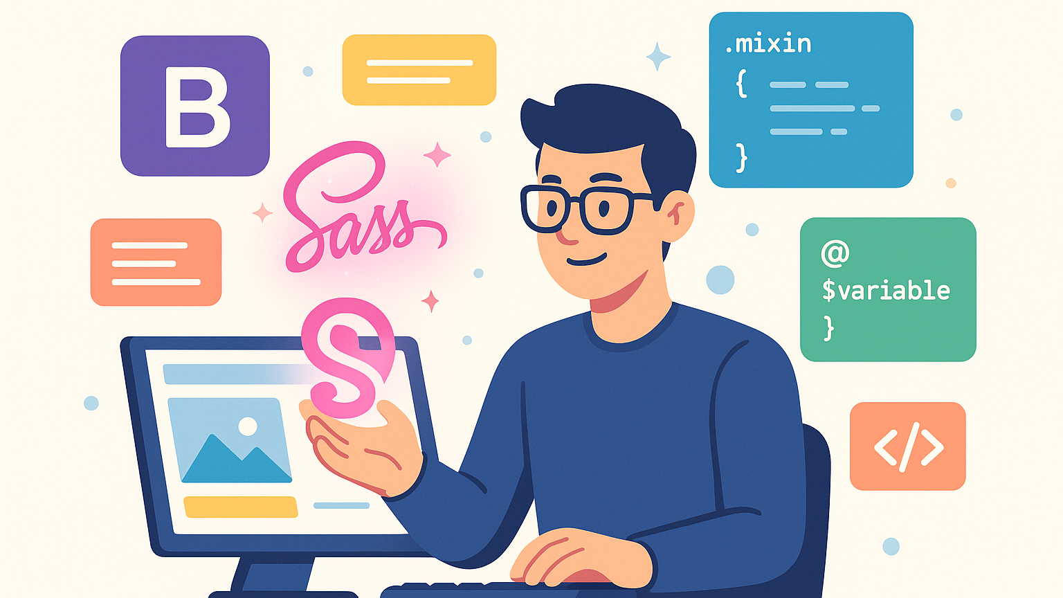
What is Sass?
Sass is a CSS preprocessor that extends the capabilities of standard CSS. It lets you use variables to store colors, fonts, or any value you might reuse, nest selectors to mirror HTML structure, and create reusable chunks of code called mixins. Sass files are compiled into regular CSS that browsers understand, but the development experience is vastly improved.
For example, instead of repeating the same color code throughout your stylesheet, you can define a variable:
$primary-color: #3498db;.button { background-color: $primary-color;}
If you ever need to change your primary color, you only have to update it in one place.
How Sass Speeds Up Styling
- Variables: Store values like colors, font sizes, and spacing. This makes it easy to maintain consistency and update styles globally.
- Nesting: Write CSS that reflects your HTML structure, making stylesheets easier to read and maintain.
- Mixins: Create reusable chunks of code for common patterns, such as vendor prefixes or button styles.
- Partials and Imports: Split your styles into multiple files and import them as needed, keeping your codebase organized.
- Functions and Operations: Perform calculations and manipulate values directly in your stylesheets.
These features save time and reduce errors, especially on large projects with many components.
Sass in Modern Workflows
Most modern frameworks and design systems, including the latest versions of Bootstrap, use Sass under the hood. This means that learning Sass not only helps you customize Bootstrap more effectively but also prepares you for working with other tools like Foundation, Bulma, or custom design systems.
With Sass, you can create your own design tokens, build themes, and ensure that your styles are scalable and maintainable. For example, you can define a set of spacing variables and use them throughout your project, ensuring consistent margins and padding.
Getting Started with Sass
To start using Sass, you’ll need to install it via npm or another package manager, or use an online compiler. Once set up, you can write your styles in .scss files and compile them into CSS. Many build tools like Webpack, Gulp, and Parcel have plugins for Sass, making integration seamless.
Here’s a simple example of how Sass can improve your workflow:
// _variables.scss$font-stack: Helvetica, sans-serif;$primary-color: #333;// styles.scss@import 'variables';body { font: 100% $font-stack; color: $primary-color;}
This modular approach keeps your code clean and easy to update.
Conclusion
If you’ve relied on Bootstrap for rapid prototyping and development, learning Sass is the logical next step to unlock greater flexibility and control over your styles. Sass empowers designers to write DRY (Don’t Repeat Yourself), scalable, and maintainable CSS, making it easier to manage large projects and implement custom designs.
By adopting Sass, you’ll be able to customize frameworks like Bootstrap more efficiently, create your own design systems, and keep your stylesheets organized as your projects grow. Whether you’re working solo or as part of a team, Sass is an essential tool for modern web design, helping you style faster and smarter.