
Building web pages once involved struggling with floats, tricky positioning, and even old HTML tables to place elements, often breaking on different screen sizes and hindering responsive design. CSS Flexbox revolutionized this by offering a powerful, yet simple, method to arrange items in a single row or column. It provides precise control over space distribution, alignment, and order, making modern layouts straightforward. This guide will explore Flexbox fundamentals, alignment techniques, space distribution properties, and advanced applications.
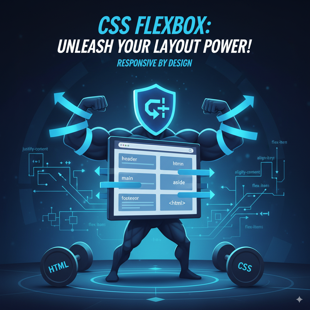
Understanding Flexbox Fundamentals
Grasping Flexbox begins with its core components. A parent element transforms into a flex container by applying display: flex; or inline-flex; in its CSS, creating a special context for its children. These direct children then become flex items, gaining the flexibility to be easily aligned, ordered, and sized. The flex-direction property dictates the main axis of layout; row (the default) arranges items horizontally, while column stacks them vertically.
Read more on MDN: Basic concepts of Flexbox
Controlling Alignment: Justify-Content
Once flex items are established, justify-content becomes crucial for aligning them along the main axis, providing precise spacing options. Values such as flex-start, flex-end, and center position items at the beginning, end, or middle of the container, respectively. For dynamic spacing, space-between distributes items with space only between them, space-around adds even space around each item, and space-evenly ensures equal spacing everywhere.
Read more on MDN: justify-content
Mastering Alignment: Align-Items and Align-Self
While justify-content manages the main axis, align-items and align-self control alignment along the cross axis, perpendicular to the main axis. align-items governs how flex items line up across the container's cross axis, with stretch (default) making items fill the container's height, flex-start aligning them to the start, flex-end to the end, center for vertical centering, and baseline for text alignment. To individually override align-items for a specific flex item, align-self is used, accepting the same alignment values.
Distributing Space: Flex Grow, Shrink, and Basis
Flexbox excels at dynamic space distribution through flex-grow, flex-shrink, and flex-basis. flex-grow determines how much an item expands to fill available space, with higher unitless values leading to greater expansion. Conversely, flex-shrink dictates an item's contraction in insufficient space, with higher values causing more aggressive shrinking. flex-basis sets the initial size of an item before any growing or shrinking, acting as width or height depending on flex-direction. For cleaner code, the flex shorthand property combines flex-grow, flex-shrink, and flex-basis into a single declaration, such as flex: 1;.
Advanced Flexbox Techniques and Use Cases
Flexbox extends beyond basic rows and columns. Responsive grid layouts can be built using flex-wrap: wrap; combined with flex-basis to define column widths, allowing items to automatically wrap onto new lines. The order property enables visual reordering of items without altering the HTML structure, which is useful for adapting layouts to different screen sizes or accessibility needs. Additionally, nesting flex containers—where a flex item itself becomes a flex container—allows for the creation of intricate, layered designs. When comparing Flexbox with CSS Grid, Flexbox is ideal for one-dimensional layouts (single row or column), while CSS Grid is designed for two-dimensional structures (rows and columns simultaneously), often used together for complex page layouts.
Read more on MDN: Flexbox guide
Conclusion: Embracing Flexbox for Superior Layouts
CSS Flexbox has fundamentally transformed web layout design, offering a simple yet incredibly powerful system for content arrangement, space distribution, and responsiveness. Mastering the concepts of flex containers, flex items, justify-content, align-items, and dynamic properties like flex-grow, flex-shrink, and flex-basis is crucial for solving most layout challenges. Consistent practice and experimentation with these properties will lead to confidence in creating robust, modern web layouts.